No startling technical advances here, just new things for our team and the speed with which we did it! Our team has been busily publishing updates about the government response to the floods in Pakistan. Most information follows our usual model: news items, case studies of the impact of aid on individuals, photo galleries, and short video clips when we have them. This is all brought together via a single rolling news page.
Last week someone had an idea that we should create a page which helped people to visualise the situation. As it is extremely difficult to get frequent updates from the team based in Pakistan, we knew we would have to work with the information we had, so gathered together a selection of maps and factsheets (all material that was already published, just scattered and in different formats.
We would have liked to use wordpress – the platform we now use for all sorts of interaction such as the DFID bloggers and a range of consultations. However, for various reasons this wasn’t possible, so we needed to work with the templates we use for the main site. This was rapid development in action – different ideas were drafted, many discarded, then screenshots created of possible solutions which were passed around for approval.
We decided to use the visualisations available via the IBM platform Many Eyes. This is a beta site, and we had never played around with it, and certainly never embedded this sort of material onto the site, but we have been impressed by the sort of charts and diagrams it produces, so wanted to give it a go. Three data sets were created (and this was far from a simple exercise, as the information was in a range of format, little used the same units of measurements: tons of aid, or units eg numbers of tents, or amount of funds given to different organisations), and a series of tabs set up so people could click between them.
For the second part of the page, we embedded first a static map. It is the simplest way to show the scale of the flooding – although we were also hugely impressed by some work the BBC have done which overlays map data onto something the viewer is familiar with. Take a look at their Dimensions site.
We also created a map which displays the sets of images we have published via flickr. Neat, but we can’t really geotag them precisely, so that is definitely more for illustration than a definite record of precise locations.
A frenetic period of work, and there is still lots to be done as we work out processes for obtaining updates to the information. However, it is satisfying to be able to produce something completely new for our site in less than a day and a half. If you are interested, visit the Pakistanfloodsmonitor

DFID: Pakistan floods monitor
UPDATE: unfortunately, the Many Eyes site which we used to create the bubble charts has been unavailable for the last couple of days, so we had to come up with an alternative. Thanks to an intensive afternoon and evening’s work, the Floods Monitor page now has a new set of graphics, created using google docs. Not as colourful, but clear and crisp looking – and hopefully more stable. Now to turn our attention back to wider publication of the underlying data sets we used to create them – now that good links have been established with our colleagues on the ground who are providing regular updates.
Involving more people and at more locations than last year, Young Rewired State reached its climax yesterday with presentations from young coders in London.
Besides the teams from London, Brighton, Manchester and Norwich, plus lone coders from Dundee and Reading, crowds arrived at the top floor offices of Transform yesterday to see what the coders had been able to come up with during the week.
Judges were Andrew Stott (Government’s Director of Digital Engagement), Helen Milner (UK Online), Ben Hammersley (Editor at large of UK Wired magazine), Mark O’Neill (CIO at Dept for Culture, Media & Sport) and, selected at the last minute from the crowd to replace a judge who couldn’t make it, Marisol Grandon – my own colleague from DFID!

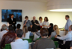
Judges with the winning coder of SocialLibrary
Winners were led by what was probably my favourite app – and one which I can definitely see myself using – and recommending to friends and family: Social Library. It mixed together elements from Facebook with data from your local library – so you could find out what friends were reading, recommend books, I think there was an amazon type idea too where SocialLibrary would recommend things based on your likes. Once you had identified something that you liked the sound of, you could see if it was available at your local library (or wider if you were in a network), and either reserve or request it. Brilliant – I hope this one is developed further!
Runner up was Gimmie 5. I arrived partway through their presentation, but I think it was a calculator to help students work out what % would get you what grade in your GCSEs
And there were honourable mentions for
- Taxman – a basic income tax calculator to help you work out taxes if you had multiple jobs and income rates. It seems amazing something like that doesn’t already exist
- Tube Smart – which built on existing apps that help you simply plan your journey, and used TfL real time data to tell you the levels of traffic at particular stations – showing you when there were bottlenecks or times when it might really be better to walk to the next station. Data was shown via circles of varying sizes superimposed on the tube map. Historic data was also stored, so besides real time, you could use it to check out patterns and see if there were times to avoid at your local station.
- Psych Survival rates – one of the more macabre offerings, the coder had taken data about survival rates from mental health institutes in Scotland (other countries are not available…) and produced a neat little app so you could find out your chances of coming out alive. To help calm nerves, he had also illustrated each entry with a helpful fact that equated each statistic to something else – like the same likelihood of suffering from psoriasis!
- Pick my house – a tool for when you have no idea what an are is like, and have house details from an estate agency. Pick a selection of postcodes, they are plotted on a map, then pages aggregate crime stats, information on local schools etc. A bit similar to another app produced: Postcode lottery – although that enabled you to compare data on postcodes from all around the country.
Other classes were:
Most likely to be bought: Bus timetables – using data just made available from their local bus company, the team produced a deceptively simple app which told you all the information about which stops different bus routes called at. I think it might have been the same team who also produced an app which overlaid real time bus information onto a map – so you could see exactly where specific buses were.
The “Wish I’d thought of that” aware went to Not Late – a neat app into which you input where you needed to be and when, and it calculated when you need to get up, the best route to your destination and when you needed to be where. In a neat incentive and social media link up, it also awarded a cup if you were on time (and a slightly less shiny one if you were ‘fashionably late’) which you could share on your facebook page.
Best coding – NatuSearch – which Ben Hammersley commented was the first app shown at this type of event where even he wasn’t sure exactly how it had been done! It took large complex data sets and enabled you to query them using natural language. UPDATE: discovered the coder behind this is James Cunningham
CIO council award for the app most likely to annoy the CIO council always raises a smile, and this time it was given to 2 apps: Gov Spark – probably the one closest to my actual day job, as it aggregated data that government departments are all tasked with publishing this year about their energy use. DFID has done this, but I guess the developer only had time to choose a few examples; and What Block? – which reminds me of something a colleague did a while ago. It is an app to aggregate data on which websites people working in a particular institution, or in a school or college have access to. Individuals visit the app, websites are displayed in a window – you simply indicate whether you can see it or not. The coder did recognise that an app such as this relied on people telling the truth!
Finally, the app most likely to get you fired was awarded to the i-wanted list – in fact that is probably exactly the sort of app the category was invented for. Judges thought the whole concept was probably illegal, totally open to abuse and probably impossible ever to bring into reality – but it did make everyone smile. It brought photos from the “most wanted” lists to your phone, then if you were walking down the street and saw someone suspicious, you could take their photo and send it in……. start to see the civil liberties issues here?!
One I liked that I’m sure only just missed out on an award was Unisearch – similar in concept to the Pick my house app, you chose the subjects you wanted to study and it listed the colleges offering those courses. Sounds familiar, but the added features were plotting those institutions onto a map, and adding other data which potential students would definitely be interested in – what the area was like (crime stats again) local facilities – and I’m sure I noticed something about night life – not sure where they got that data from! Also a neat site that I got the impression had been put together in a couple of hours, which took historic photos of Manchester and displayed them alongside modern ones taken from flickr.
From my notes, the teams and individuals produced a total of 28 apps – but the presentations came fast and furious, so its completely possible I’ve missed a couple. Also, apologies to anyone whose project I have mis-described – please feel free to correct me or provide more information in the comments. For people who want to catch up, links will be published on the main Rewired State website over the next couple of days.
The crowd from Manchester even found time to come up with a rap – video now available on Tim Dobson’s blog.
Overall, another storming success from the organisers – but I did note from the programme that they found it extremely hard to get sponsors – so anyone who wants to help make sure this ever happens again should get in touch with them!
UPDATE: Full write up from Rewired State team – with full name credits of each team, plus links to photos, films and more
Twitter led me to discover a photography project that says as much about friendship as it does about the man who took the polaroids. Jamie Livingston took a photo a day every day for the last 18 years of his life. He lived in New York, and the collection charts lots of everyday things: his friends, the changing city, what he ate and what he did, every day until he was diagnosed with and eventually died from cancer.
After he died, his friends decided that this huge body of work should not just be discarded, so they re-photographed every one of the 6,607 photos, created a website and put on an exhibition. The site was stumbled across by a journalist and his research and subsequent blog about what he found out led to the site – which had initially collapsed after many thousands of visitors arrived (one blog claimed ” at times it is receiving something like 150 hits per second”) being moved to much more stable servers. I recommend the more detailed blog about the project, which is fascinating reading.
One post in particular I found particularly relevant, in the light of my own photo a day project (which is definitely put into perspective by this huge undertaking):
I had to think a little bit about why this is so stirring. This is not a technical achievement, nor an endeavor that requires an inaccessible skill set. This is one thing, done once a day. Something so spare and ordinary, just taken to extraordinary lengths. A simple thing: whatever struck his fancy on a given day – just capture one thing on film. Simple.
I know a lot of people try to do this on Flickr, but this is strikingly different in many respects. This isn’t a collection of forced poses or composed shots or juxtapositions, he isn’t looking for something funny, weird, or ironic. I find myself thinking I should try this, but give up within days because I’d try to wait until something interesting happened. That’s me not appreciating the ordinary, or trying to force it, and not having the discipline to just do something on principle. These photos are as simple as memories. They don’t always make sense, they don’t always fit into some grand theme or design. Here is a memory. Here is another. All you need to know is: this was then, on this date. This happened, I was there. Do you remember?
Other photo related things that have cropped up recently:
- The UN launched a photo competition – called Picture This, they were looking for photos depicting people taking action to achieve any of the 8 Millennium Development Goals. Winners will be announced in September
- The Living Proof project – more than just photographs, but they are worth browsing
- A project to showcase photos that flickr considers “most interesting“
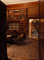
- And finally, the good news that the National Trust now allows photography inside many of its properties – proof below!

Dyrham Park library
UPDATE: A friend pointed out 2 other interesting photo a day projects: A photo a day – check out the website to find out about it and a variation on the 365 flickr project : 1984 Aleks’ project to re-tell the first 369 words of George Orwell’s novel one day at a time, one word at a time, in photos.


